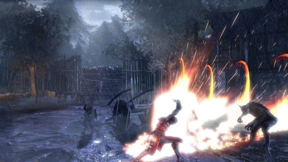
Konami recently sent us a copy of their new title, Castlevania: Lords of Shadow. After testing the game, it was clear that the game could be a case study to highlight the difference between usability and user-experience (UX).
Graphics are exceptional, as shown in the picture above (from the first level in the game). Usability is great as well: the first level slowly introduces the player to basic movement and combat in an embedded (situated) context, rather than in a separate tutorial. Game moves are introduced as they are needed to deal with enemies in the game, with all of the basic moves covered.
An easily-accessible book containing all of your character’s moves is a button-press away at all times: utilizing what academics might call ‘cognitive offloading’ – a means of having external representations available in the game (to look up moves, when needed) so that player attention can focus on the core gameplay. In other words, Quality Assurance (QA) did their job particularly well (besides the inability to rotate the camera angle in the 3D world). In particular, the first level of the game was excellent at teaching players how to play the game.
While QA did a great job with basic usability, effectively teaching the game players how to play, they failed at the overall user-experience in the game. Situated Research often explains to clients that QA is similar to testing code for bugs, while user-experience (UX) research is similar to testing a game’s design. In the case of Konami‘s new game, Castlevania: Lords of Shadow, the gameplay experience often resulted in button-mashing, where advancement in the game required a sore thumb from tapping the controller rather than formulating strategies to use in-game tools to overcome enemies. The latter (ability to create and test strategies) requires a game design quite different than what was found in Castlevania, where overcoming enemies was typically achieved through rounds of dodging an enemy’s very predictable AI followed by some strikes (before the next dodge was required).

Prior research (conducted by Situated Research and reported in our publications) describes how game players learn within games, and specifically how they progress through different phases of learning. (Learning was not examined as something that was necessarily educational; rather, learning could be any ‘change in behavior’ as a result of the experience of playing the game.) This research indicated that game players went through early phases of learning the game interface and basic game controls early in the game, transitioning to a later phase of more advanced strategy development. These phases correlate to the comparison between QA (basic usability) and UX (more advanced user-experience) research. Again, while Konami excelled at teaching players basic game usability and showing them how to play, the latter felt as if it was left to the wayside.
UX research will help to test a game’s design: showing the core ‘pillars’ of the game, or where the game really excels. In other words, there should be features within the game that are spectacular, allowing players to invest themselves (and their identity in the game, for social interaction), which gives players a reason to keep coming back to play the game. While Castlevania consistently provided players with rewards (such as new moves through a combination of button-presses), many of these rewards were not meaningful. Experience from killing enemies accumulates an in-game currency with which to buy new moves, but these new moves typically feed into the button-mashing gameplay. Using the new moves requires a memorized sequence of button-presses, which pulls player attention away from strategy development (player cognition is focused on rote memorization).
While many of the game’s graphics were exceptional, and core gameplay was taught well through embedded use (very good for usability), Situated Research felt that the game suffered from a design that inhibited player strategy development and unique, invested gameplay. Game levels did not allow much exploration: players typically were fed through a narrow path within the game world, where exploration was inhibited by the inability to move the camera angle. This also affected combat several times, as the player view could not rotate to view a charging enemy that was off the bottom portion of the screen. User-experience research could have helped Castlevania‘s design by helping to design game rewards that encouraged strategy, and by making the overall reasons for playing the game more explicit. While the artwork and storyline of the game did a great job at setting the scene, the overall game objectives were much less clear: the purpose of overcoming each enemy was not evident and did not seem to lead the player closer to their overall objective.
For those interested in reading more, our previous research incorporating features of Activity theory to analyze gameplay may be of interest, as it shows the relationship between basic game controls (operations) and motivated activity; and is achieved by analyzing a game player’s reasons for playing a game (how strategy development relates to goal achievement during gameplay). Special thanks to Christian Walker and Steve White for their help with testing the game. We are interested in your comments, so please leave them below.
Written by: Matthew Sharritt, Ph.D.
Posted by: Situated Research
