One of the best books I’ve ever read on User Experiences is titled “The Elements of User Experience” written by Jesse James Garrett. In the book, he begins by telling the story of a man who wakes up and wonders why his alarm clock never went off. He goes to make coffee, but struggles with the coffeemaker. On his way to work, he stops for gas, but can’t get his credit card to work and has to stand in a long line to pay. When he is finally on his way, he is detoured due to an accident and arrives far later than he ever anticipated. He ends up irritated, sweaty, and lacking a much needed cup of coffee.
REWIND: Let’s look at WHY each one of these situations happen and how they relate to poor user experience design. The traffic accident caused by a man who had to take his eyes off the road to lower the radio’s volume. The radio had a poorly designed knob layout and was confusing to our driver. The line at the gas station was so long because the cashier had to use a complex and confusing system to charge clients. The fact that he had to stand in line at all was because the gas pump didn’t offer any instructions on how to properly insert your card. The coffeemaker didn’t work because he had to push the button all the way down but there was nothing to let him know it was turned on or not – no lights, sounds, no feedback. And everything started when his cat stepped on the alarm clock, resetting it without notification.
Can you relate?
I’m pretty sure we’ve all had experiences like this. Our technology and appliances aren’t always very clear in their use. However, we ALL are forced to interact with these failing user interfaces on a daily basis. It’s the TV remote, the pay kiosk at the parking ramp, and especially the custom Excel spreadsheet you use to track expense reports. In order to get what we want from these interfaces, we have to successfully interact with them and that can be difficult.
That said, we have seen a huge increase in good (read: not great) user experiences over the past decade. As we become more and more reliant upon different inputs, we’re bound to learn what works and what doesn’t and that directly affects the development interfaces we use today and in the future.
Assessing the User’s Needs
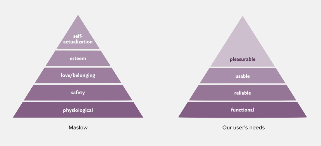
In 1943, Abraham Maslow introduced Maslow’s hierarchy of needs. In it, he described what we need as humans to fully operate. From physiological (air, water, food) to safety (personal security, financial security, health), love (friends, family, sex), esteem (self-respect, self-esteem), and finally self-actuallization (reaching your full potential).
How does this relate to UX Design in the digital and physical world? Maslow gives us the method to understanding the needs of our users. Take online banking for an example:
- Make the interface functional. It would mean the user being able to login, pay bills, and view an account summary.
- Make it feel safe for the user to use. I don’t need to tell you how crucial that is for the banking industry and a user will refuse to use something that even APPEARS to be unsafe.
- Make it usable. It needs to be easy to navigate between pages and it all the functions exactly as the user expects.
Note: This is where 99% of all services end, but great UX design goes further. - Make it pleasurable. I know what you’re thinking – a pleasurable online banking experience? Crazy! It may seem laughable, but it’s only crazy until someone actually makes one. Then the whole industry will scramble to catch up.
 Using Maslow’s hierarchy of needs to create great user experiences
The Extra Effort goes a Long Way
Great user experiences are the result of putting in the extra effort. When usable just isn’t enough. Maslow states that when a person is fully self-actualized, they find contentment as their needs have been all fulfilled. A user finds that same sense of contentment using a product that invested in creating a great user experience. That fully contented user is happier to be a returning customer and brand advocate.
Written by: Anton Sten
Posted by: Situated Research
