I’m writing this from a slightly saddened perspective, revisiting my favorite SNES RPGs and realizing something:
I’ve been spoiled by modern UX design.
The sentiment is pretty universal. Hugon on the Quarter to Three forum writes:
“When I think ‘console RPG’ I think pages of fairly inscrutable character info and bad navigation. You cry tears of joy if you can just get a basic item comparison.”
Thanks, “good UX.”
In the past, I expected everything to be a bit rubbish. Sitting in the back of my dad’s car, smashing the Nokia keypad trying not to let the snake eat its own tail — I wasn’t thinking about it any deeper than “hehe,” “wow” or “ahhh…”
Replaying the old classics wasn’t all bad, though. As well as the experiences that no one would be caught dead designing, there were a few things I noticed that have carried over into highly praised apps.
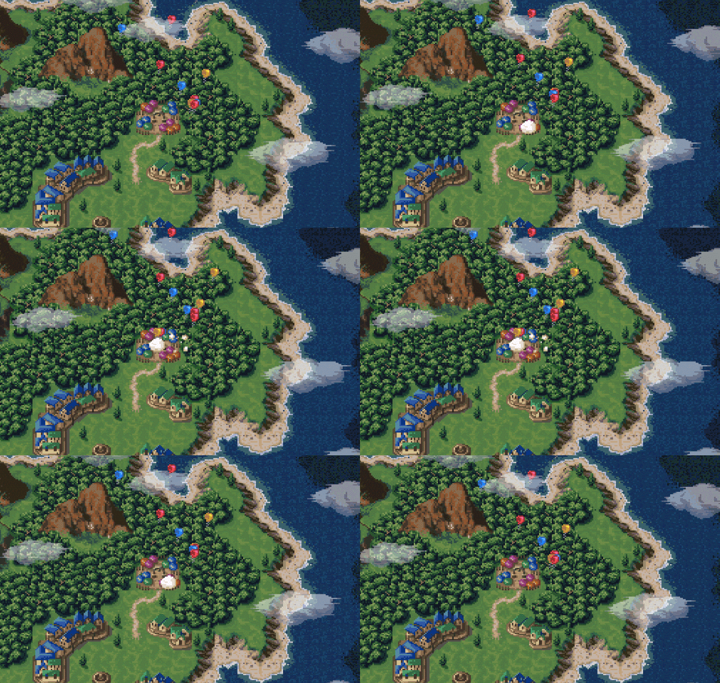
This post is about the evolution of UX — although we know it now as a way to keep users sticking around — this is from a time period when it wasn’t so much of a big deal.
I got to play a lot of games, record the screen and see UX and video games in a new light. It’s about the good and bad parts of 1990s Japanese video games, and what we should (and shouldn’t) learn from them today.
“Pulsing circles” as part of a tutorial
In the first 10 minutes of Final Fantasy III, you come across a small, glowing light — something that’ll entice any gamer in search of loot. What you get instead is a lesson — not in the instruction booklet that nobody would bother to read, but baked into the gameplay:
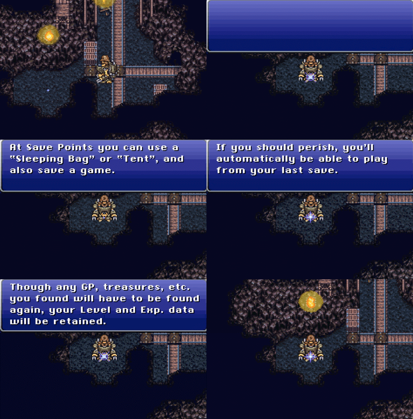
I’ve looked before at how Microsoft hid user onboarding lessons inside Minesweeper and tricked users into adapting to a GUI, and it seems this is an equally ancient example.
In Final Fantasy III, however, it’s exciting because it’s exactly like a tactic used recently by Slack (and plenty of other SaaS apps):

And, because Slack’s user onboarding process has since changed, here’s a .gif of the same idea in action in Process Street:

It’s the same idea. A transitory, floating point of interest — sparkles on a cave floor. A tiny piece of information hidden in the UI to help users learn as they go, instead of having to break out the biblically oversized user manual.
The death of the instruction manual and move toward learning by doing is common in all kinds of onboarding, much as relying on someone to get from 0-60 on their own isn’t necessary or expected when there are other ways of teaching.
Microinteractions to show time and care in design
In Nick Babich’s article on microinteractions, he says:
”The best products do two things well: features and details. Features are what draw people to your product. Details are what keep them there. And details are what actually make our app stand out from our competition.”
One example of a “delightful” microinteraction is the Twitter heart. It used to be a case of clicking the star and it turning from gray to yellow; now, as we all know, this happens:

There are some pretty good arguments against spending design time on microinteractions, but in video games, it’s part of the immersive experience.
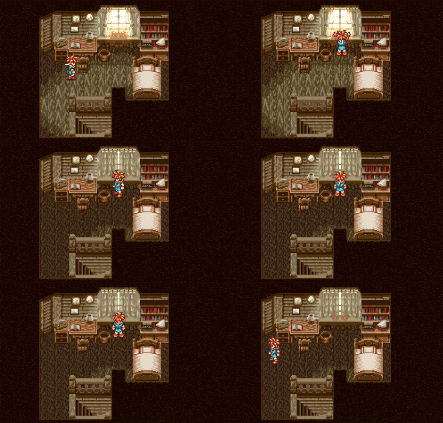
Chrono Trigger is one of the few SNES RPGs I’ve played where poking around mundane rooms pays off. In the very first room, when your mum wakes you up, it’s possible to open and close the curtains.
In a genre where the game is mostly story-driven and the actual mechanics seem to be an afterthought, this is pretty awesome. As you can see, I had to do a quintuple take:
Menus have (thankfully) improved a hell of a lot
You can’t appreciate the wonders of modern menu navigation if you’ve not been through some of the more poorly designed UIs from the 1990s.
Now, I know it’s not the primary concern of RPGs (and, in fact, something they’re most often criticized for anyway), but the first menu system from Breath of Fire just doesn’t make sense. Bearing in mind this menu is presented before the game has ever started, check this out:
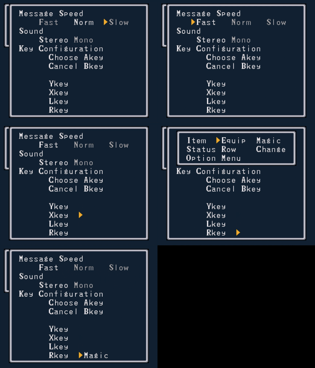
The key issues:
- There’s no quantification of what “Fast,” “Norm” and “Slow” even is.
- The Key Configuration section for Y, X, L and R is confusing because the arrow is seemingly floating in the middle of nowhere
- When you press “Choose” on the floating arrow, there’s no explanation as to what any of these things are. Why would(n’t) I want “Magic” assigned to R? What even does it mean?
It’d be far more helpful not to force this before gameplay, and to leave it as a preferences menu somewhere in-game.
It’s unfair to compare menus from 1990s games to modern SaaS products, but thankfully, I didn’t have to. Here’s a much better menu from Super Mario RPG: Legend of the Seven Stars, a game known for its elegant design:
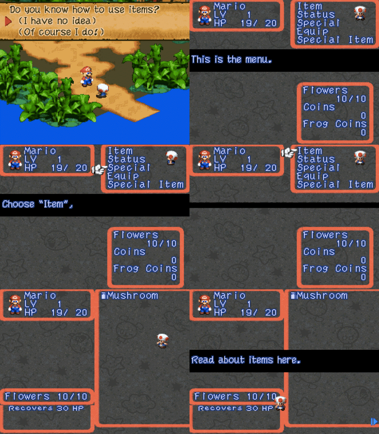
It even comes with a little onboarding primer, unlike the menu in Breath of Fire, which surfaced before I even saw what the game looked like.
Filling user details with smart defaults
Thanks to social media, smarter design and the realization that no one wants a blank profile picture or the need to spend time filling in their details, information like thumbnail and full name is often pulled in automatically by apps when you sign up. Take Medium, for example:

Like Samuel Hullick points out in his teardown of Peach’s user onboarding flow, that’s much better than the default silhouette and [username not entered].
Here’s a pre-cursor to that approach from Chrono Trigger, kindly filling in your default name, with the cursor ready to overwrite left-to-right if you want to choose another name:
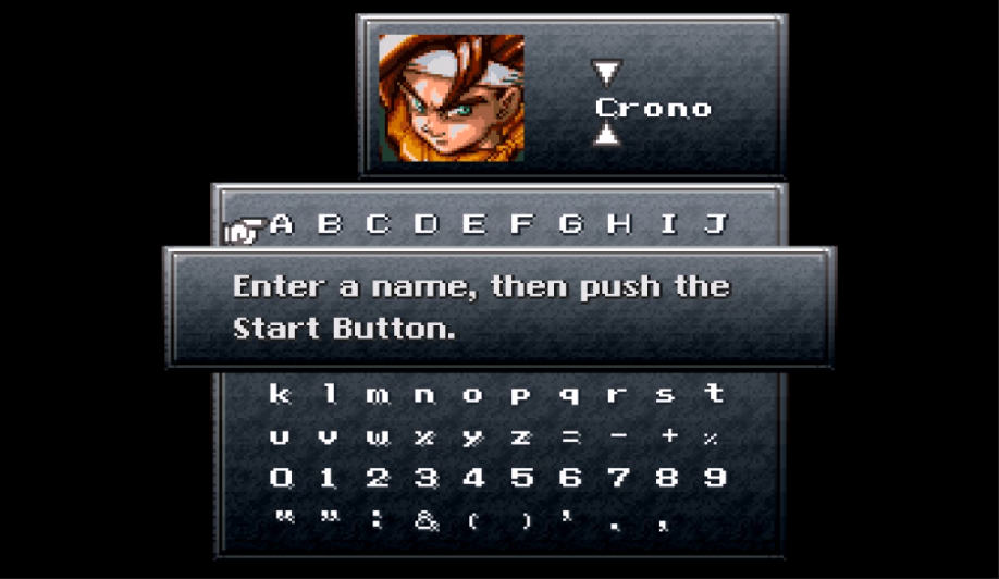
This reduces friction at the most vital moment — first use.
Show which parts of the screen are interactive
At a high level, a user interface consists of two groups of things: things with which you can interact and things with which you can’t.
Badly designed interfaces make it difficult to decide straight away whether an element is interactive, whether it’s for displaying data or just for decoration.
With SNES games, it’s sometimes a matter of trial and error to find which parts of the screen you can interact with, but unlike apps with freeform (mouse/touchscreen) controls, the number of options is limited to wherever you can move the cursor with the arrow keys. If you can’t move your cursor there, you can’t interact with it.
That leads to confusing interfaces like the one I looked at earlier from Breath of Fire — how was I supposed to know there’s an input field there?
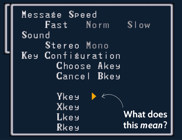
In the same way Final Fantasy III shows you a part of the environment is interactive, there are parallels in modern apps.
Check out Peach (left) and Buffer (right) for a contrast of how interactive UI elements are displayed:

With touch/mouse-controlled UIs, the user could theoretically click anywhere. The awkward Breath of Fire menu shows that interactions can be misleading, even when there are limited places to “click.” Peach’s enticing button looks tappable, but it gives you an error message; Buffer has the balance right by showing buttons you can’t interact with by keeping them gray.
Storytelling to hook the user’s interest
Every classic Final Fantasy game follows the same structure. Like a Shakespeare play, you’re thrown right into the middle of a story, with only the tone of the start screen for context — like, “What’s all this lightning?”
The story unfolds over the course of a painfully slow 5-10 minute cut scene of sprites shuffling around, and references to an array of names and places you have no idea about.
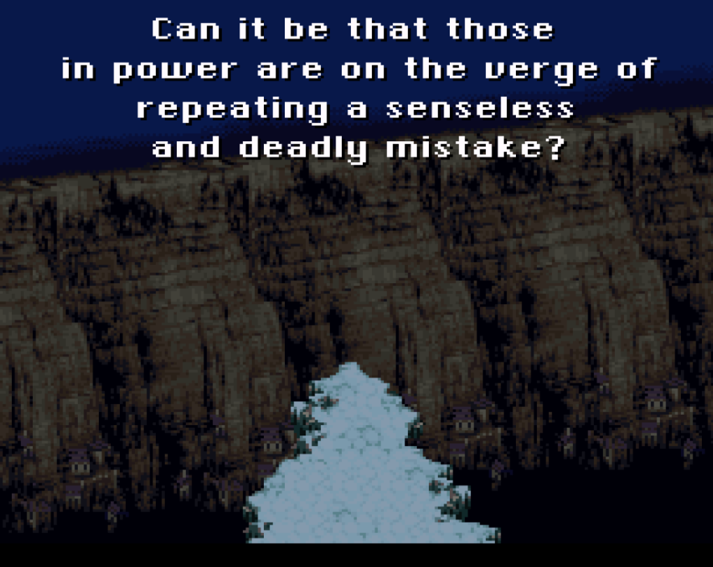
But that’s what fantasy stories are, right?
They don’t start at the beginning of time, and even if they follow the dumbed-down “This is me, I’m from a town called X” format, you’re going to be thrown into a universe you never previously knew existed. (In an earlier article I addressed how astonishing your user isn’t the best idea.)
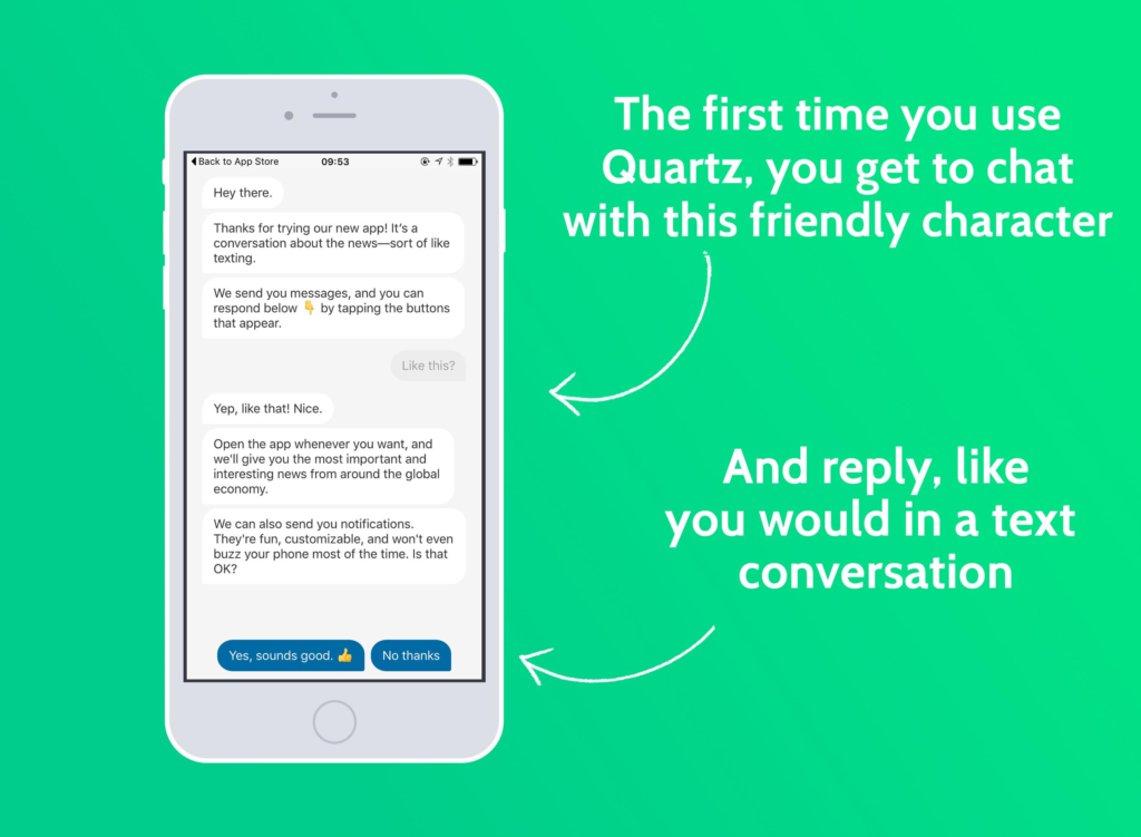
It’s the same deal when you start with a new app. Part of the user onboarding process is reducing that initial overwhelm factor. Quartz does a good job at this by situating the app in a familiar environment — texting — with a talkative AI.
Did 1990s video games care about UX, anyway?
Setting aside some obvious clunkers like Dragon Age 6 and Breath of Fire, it seems like the user experience of SaaS apps have been informed by the past. Some, like Duolingo and Habitica, take direct inspiration from old-school RPGs.
It’d be unfair to say 1990s video games didn’t care about UX, but unlike today — 14 years after the first major UX primer came out — it wasn’t a high priority.
While SNES technology limited the complexity and elegance of the games it ran, it’s only clumsy in retrospect because we’ve been spoiled by silk-smooth interfaces and “delight.”
After all, until now I never complained about Final Fantasy’s UI — I sat down, shut up and played it until 4 am.
FEATURED IMAGE: AKIRA TORIYAMA
Written by: Benjamin Brandall, TechCrunch
Posted by: Situated Research

